
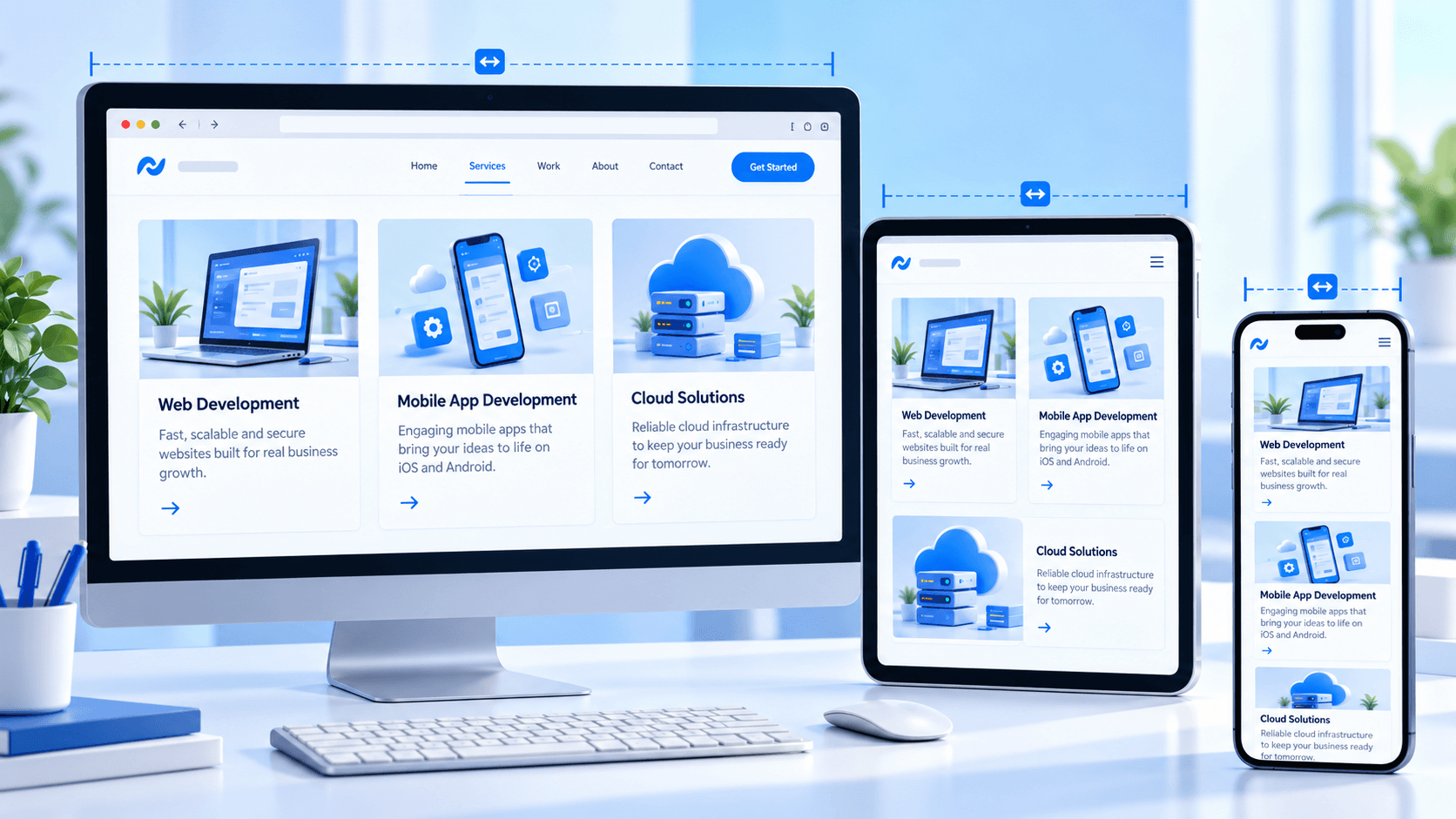
A page that shrinks to fit a phone is not necessarily usable on one. Responsive testing should follow the tasks visitors need to finish, from reading a service description to sending a form.
Test at content breakpoints
Resize until the layout starts to struggle rather than relying only on named devices. Look for headings that wrap awkwardly, cards that become too narrow, menus that collide with the logo and images that hide important information. Include a small phone and a mid-size tablet.
Walk through interactions
Open the menu, use filters, complete a form and follow a call to action on touch. Check focus order with a keyboard as well. A desktop hover effect should never be the only way to find an action.
- Buttons need enough room to tap without errors.
- Inputs must stay visible above the mobile keyboard.
- Errors should appear next to the relevant field.

Review text and media
Use realistic long titles, large text settings and translated or user-generated content if relevant. Confirm that images scale without clipping key details and that videos do not force horizontal scrolling. Avoid fixed heights for cards that contain variable text.
Repeat checks after content changes
New blog titles, navigation links and footer copy can break a layout after launch. Keep a short list of representative routes and retest them when shared styles or components change. Screenshots help, but a hands-on task check catches interaction problems.
Practical next step
Responsive quality comes from testing real content and real tasks at the widths where the design changes, not from making every element smaller.
Explore BS InfoTech services or tell us about your project.